“All facets of writing, publishing, and marketing are covered in this book through the voice of a publisher and entrepreneur, which gives Staflund’s book more credibility and value than many other guides on the market today.” ~Penn Book Review ** Penn Book Review by Elizabeth Smith-Gardiner, an academic writer and Communications professor currently teaching at the Texas A&M University (2014), who endorses How to Publish a Bestselling Book as future publishing course material. **
“…Staflund gives good advice and it’s remarkably far-reaching, considering that it covers several countries … [A]n enlightening, helpful book which gives you an excellent introduction to the business of publishing.” ~The Bookbag
“As a veteran of the publishing industry, Staflund certainly is an authoritative voice and provides helpful guidance in her newest book, How to Publish a Bestselling Book … [A] must-read for any writer hoping to publish their next book.” ~Hollywood Book Reviews
“Staflund’s respect for the writers at the heart of the publishing process makes this a worthwhile addition to any aspiring author’s bookshelf.” ~ForeWord Reviews, Clarion Review
“[T]here is a wealth of information within these pages. … Staflund holds nothing back, and because of that, How to Publish a Bestselling Book has the feel of a roadmap. Just follow it, and it will easily take you where you want to go.” ~Pacific Book Review
“…exceptional, practical, detailed, comprehensive, and thoroughly ‘user friendly’ from beginning to end.” ~Midwest Book Review
You might consider syndicating this content on your own blog. If you do, make sure to attribute the original source so neither of us gets dinged on the SEO front. You can do that by including this line at the bottom of the article: This content first appeared on the PPG Publisher’s Blog and has been republished here with permission.
“Staflund’s stated goal is to give Canadian authors insight into what it takes to produce a salable book in Canada, get it into the hands of the desired demographic, and earn a healthy profit in the process. In this, she has succeeded admirably.” ~ForeWord Reviews, Clarion Review
“A good source for writers of all experience levels seeking to publish quality books in Canada.” ~Kirkus Reviews
“This book is a real, and I mean real, learning tool … You will know how to do what the title states when you finish Kim Staflund’s book.” ~Palmetto Review
“How to Publish a Book in Canada is a very instructive book for any author—in and out of Canada. Though the book is specifically for Canadian authors, writers from any country will gain insight from this book.” ~Pacific Book Review
“Staflund’s personal stories, humor, and examples throughout makes this book entertaining as well as instructional . . . How to Publish a Book in Canada is a great investment for future publishers—both in Canada and outside of Canada.” ~Penn Book Review
“This is the first book I’ve read where the author has put in a tremendous amount of research into the book … All writers must have a copy at the side of their writing desks.” ~Inkspand
You might consider syndicating this content on your own blog. If you do, make sure to attribute the original source so neither of us gets dinged on the SEO front. You can do that by including this line at the bottom of the article: This content first appeared on the PPG Publisher’s Blog and has been republished here with permission.
When choosing illustrations, graphics, or images for your book cover—or in your book’s interior, for that matter—you must ensure you have the legal right to use them.
Choosing Illustrations, Graphics, or Images for Your Book
There are three ways you can do this:
one, you can use illustrations, graphics, or images that you have personally created and therefore own the copyright to;
two, you can purchase the right to use artwork created by someone else;
or three, you can find public domain stock photos that are deemed as “free for commercial use” from whatever design-template program you are using, or from websites such as Pixabay.com, as I did for this blog post.
Actually, I use Pixabay graphics for most of my blog posts. I always seem to be able to find what I’m looking for there.
Choosing Illustrations, Graphics, or Images for Your Book
It is crucial to respect another artist’s copyright. If you don’t—if you just pull any image file you find off the Internet and use that for your book without first confirming you have the right to use it—you may find yourself involved in an expensive copyright infringement lawsuit down the road. This isn’t only about protecting the rights of other artists; it’s also about protecting yourself. So, do a little research before you use any images for your books. Pixabay is one of many websites containing free stock photos. You can find even more resources here: http://www.warriorforum.com/main-internet-marketing-discussion-forum/1257937-avoid-copyright-infringement-use-tool-find-free-stock-photos-your-display-ads.html.
You might consider syndicating this content on your own blog. If you do, make sure to attribute the original source so neither of us gets dinged on the SEO front. You can do that by including this line at the bottom of the article: This content first appeared on the PPG Publisher’s Blog and has been republished here with permission.
Printers and publishers have a lot in common in terms of what their graphic designers will and won’t do. Today’s post will help you understand why.
Printers and Publishers: What Their Graphic Designers Will and Won’t Do for You
First and foremost, I’m referring to hybrid publishers as opposed to traditional (trade) publishers here. When traditional publishers purchase the rights to publish your manuscript, they are also buying full creative control of the book. That means they will make all the graphic design decisions on your behalf. You won’t have much say in anything. But in the self-publishing and hybrid publishing business models, you retain full copyright ownership of the book. As such, you also retain your creative control and must make all the design decisions for yourself. (You can learn more about today’s three primary book publishing methods by clicking here.)
Printers and Publishers Won’t Make Graphic Design Decisions on Your Behalf
Printers and Publishers Need to Know This
Twice in the last ten years, I took on projects from authors who said they had no idea how they wanted their book covers to look. I pressed them for details with various leading questions. But they both insisted they didn’t know what they wanted. They asked me to have my graphic designer supply them with two sample layouts to choose from without providing any real instructions ahead of time. I cringed. I knew where this was headed. But I obliged and asked my designer to create two sample layouts based on the little information we had: the type of book, topic matter, and stated demographic.
In both cases, the designers did their best and came up with what I considered to be beautiful, professional designs. But, not surprisingly, both authors hated the sample layouts. “That’s not what I had in mind,” they both complained. It had been a giant waste of everyone’s time.
You see, even if you think you don’t know what you want, you still do to some degree. And this is important information to provide the graphic designers of both printers and publishers ahead of time.
When deciding how you would like your book’s cover and interior to appear, it’s best to browse a bookstore (whether in person or online) and view the many different examples there first. What designs, colours, and fonts draw your attention? Write down the book titles and author names, so you can use this as a handy visual reference when it comes time to provide a description to the graphic designer. This will help the process run much more smoothly for both of you.
You can download the above book completely free of charge to obtain a check-list of the types of information graphic designers will need from you upfront. Just click on the cover image to be redirected to where it can be downloaded. I highly recommend you read it.
Printers and Publishers Won’t Choose Graphics for You Free of Charge
3 Book Printing Tips for Indie Authors
If you want to include any illustrations, graphics, or images on your book cover—or in your book’s interior, for that matter—you must ensure you have the legal right to use them. There are three ways you can do this: one, you can use photos, illustrations, or graphics that you have personally created and therefore own the copyright to; two, you can purchase them from someone else; or three, you can find public domain stock photos that are deemed as “free for commercial use” and download those. Either way, it’s best if you to provide these files to printers and publishers ahead of time. Otherwise, you’ll spend a lot more money paying them to create or find these files on your behalf.
Click here for more information regarding where and how to find public domain stock photos for yourself. Always respect another artist’s copyright. If you don’t—if you just pull any image file you find off the Internet and use that for your book without first confirming you have the right to use it—you may find yourself involved in an expensive copyright infringement lawsuit down the road.
Printers and Publishers Won’t Choose Paper Stock for You Without Some Input
I fully understand the inclination of an author to say, “Just use the standard interior and cover stock,” when asked what type of paper you want used for your paperback or hardcover books. I get it. You’re thinking that printers and publishers are the experts, so they should know what you need in this regard. Here’s the problem with that: there is no one standard.
As you’re browsing through the bookstore to determine your design preferences, take note of all the different types of books in front of you. Notice how some books are thicker than others. Some covers are glossy and shiny; others are dull. Some interior pages are thin while others are thick. The colours vary. The sizes vary. Everything varies! (Choice is a wonderful thing. But it can also be a bit of a nightmare at times.)
When you’re browsing the bookstore, take note of the types of cover and interior paper stocks that appeal to you most. Take photos of your preferences. Better yet, bring physical samples to show printers and publishers when it comes time to place your order with them.
Printers and Publishers Will Sit Down With You to Discuss All These Details and Make Recommendations
Here’s one more thing printers and publishers have in common: they want to make you happy. When you’re happy, they’re happy!
Once you’ve visited the bookstore and gotten an idea of what you’re looking for, your next best course of action is to book a graphic design meeting to discuss your findings. Ask questions, listen to the recommendations, then make your decisions from there.
Printers and publishers are here to help you create the best book possible. But they need you to help them help you by doing some homework ahead of time. Trust me, it will save you time and money in the long run.
You might consider syndicating this content on your own blog. If you do, make sure to attribute the original source so neither of us gets dinged on the SEO front. You can do that by including this line at the bottom of the article: This content first appeared on the PPG Publisher’s Blog and has been republished here with permission.
The PPG Graphic Design Style Guide was created to ensure all our graphic designers follow the same professional standards for all our books. Each vendor we hire must follow these guidelines.
1. The graphic designer is responsible for sourcing/creating the bar code for each book based on ISBNs supplied by the publisher. The bar code is always placed on bottom right-hand corner of the back cover and PPG logos should appear as shown in this image:
PPG Graphic Design Style Guide
2. The gutter and margins should be set as shown here to ensure proper spacing in final printed book:
Gutter and margins for PPG books
3. When doing initial design samples for clients, send only two samples each of both the entire cover and one interior chapter. The entire cover includes the back cover, spine, and front cover as shown above. The sample chapter should include the title page and a couple extra sample pages to show the client how the margins, headers, footers, fonts, and spacing might appear.
4. Here is a link to the cover generator (barcode generator) that Ingram Content Group (Lightning Source) uses for its books: https://myaccount.lightningsource.com/Portal/Tools/CoverTemplateGenerator. Please use this tool to generate all book cover templates for PPG paperbacks and hardcover books. It will provide the most accurate spine measurement as it factors in LSI’s chosen paper weights here.
Page counts have to be guesstimated in the beginning since we won’t know the final page count until the final version of the book has been completed, so here is a guideline to use when generating a cover template. Typically, there are 300 words on a page (in the average non-fiction/fiction book). So, if a raw manuscript is 50,000 words long, assume that the book will be 167 pages, plus another 13 pages to account for front matter and back matter, for a total of 180 pages. Always round page counts up to the nearest even number. Build the first draft of the cover for this number of pages. Change it as needed as the book changes.
5.Never include a price on a PPG book cover. Only include the barcode excluding the price.
6. Only make the author’s/editor’s/proofreader’s exact changes to a manuscript. Never make judgment calls regarding punctuation or spelling or anything other than graphic design. Punctuation and spelling are the editor’s and proofreader’s jobs. Graphic design is the graphic designer’s job.
English is far from being a simple, straightforward language. There are many different editorial style guides associated with the English language, depending on which country an editor is representing: United Kingdom, Canada, the United States of America, Australia, New Zealand, and South Africa. We all have different ways of spelling and punctuating the English language, so we each use different editorial style guides when editing books.
For this reason, PPG creates a customized editorial style sheet for all our authors—to ensure consistency in editing for each and every one of their books. Since this sheet is only shared with the editor, proofreader, and author, it is impossible for the graphic designer to know which style is being used or make any editorial recommendations.
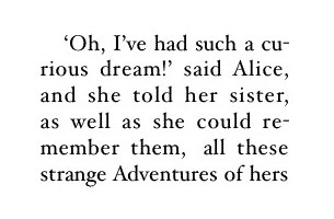
7. Eliminate all visible widows, orphans, and bad breaks from both the back cover and internal copy of the book. (You may not find them all, and that’s okay. Just do your best. The proofreader will find the rest.) “Square up” the each page so that facing pages are as symmetrical as possible (e.g., you never want the text/graphics on one page to be noticeably longer than the facing page). Symmetry is important to a professional result.
A book’s interior is usually either justified or flush left as shown in the diagram below.
The words “curious” and “remember” are badly broken up in the above sample. To avoid this, you can kern that particular block of text either slightly looser or slightly tighter to ensure the full words land on one line rather than breaking up into two lines. Believe me when I say that extra little detail can subliminally affect the quality of your book in other people’s eyes. It takes no time at all to fix it, so I highly recommend that you do.
Widows and orphans are a concern whether your text is justified or flush left as shown in the below image:
As shown above, a widow is a lone word stuck on a line by itself anywhere in a page; whereas, an orphan is a lone one or two words that have landed by themselves on a line, up on the next page. Both of these things affect the flow and professional appearance of a book whether you realize it or not. Professional publishers always ensure these types of issues are eliminated by meticulously kerning certain blocks of text throughout the book (as opposed to adding in extra line breaks or paragraph breaks in random places to try to correct the issue).
8. Ensure the table of contents and all headers/footers are accurate before sending any proofs to PPG to forward to the author for review. Each draft should be treated as a finished book and sent to the author as complete as possible.
9. The graphic designer’s fees include the cost of up to two stock photos sourced by the graphic designer for the book. Designers should do everything possible to use whatever materials an author has provided in order to mitigate having to purchase additional stock photos up and above the included two. But if, for some reason, additional graphics need to be purchased, the designer must let PPG know the price so PPG can alert the author to either pay for this or provide their own alternatives.
10. All finished and working files must be returned to PPG at the end of the project in a zipped folder that is clear, orderly, and easy for the author to access and sort through.
You might consider syndicating this content on your own blog. If you do, make sure to attribute the original source so neither of us gets dinged on the SEO front. You can do that by including this line at the bottom of the article: This content first appeared on the PPG Publisher’s Blog and has been republished here with permission.
The PPG Canadian Editorial Style Guide was created as a starting point for our editors. It is used for all PPG authors who haven’t requested another specific editorial style guide for their books.
PPG Canadian Editorial Style Guide
Obviously, English is far from being a simple, straightforward language. There are many different editorial style guides associated with the English language, depending on which country an editor is representing: United Kingdom, Canada, the United States of America, Australia, New Zealand, and South Africa. We all have different ways of spelling and punctuating the English language, so we each use different editorial style guides when editing books.
This is why PPG creates a customized editorial style sheet for all our authors—to ensure consistency in editing for each and every one of their books. The styles are driven, first and foremost, by the author’s preference (if any) as to which primary guide he or she wishes to use (e.g., The Oxford Style Manual for British authors, The Chicago Manual of Style for American authors, a special blend of the two for Canadian authors as shown below). From there, the customized editorial style sheet is created by a book project’s primary editor, and everyone else follows that editor’s lead for every single book published by that author going forward.
PPG Canadian Editorial Style Guide
Spelling and Spelling References
A-B-C-D-E
Use behaviour and behavioural, not behavior and behavioral
Use clamour, not clamor; but write clamorous, not clamourous
Use colour (and colourful); not color or colorful
Er and ‘er: Use the word “er” to denote a speech filler, but use ‘er to denote an informal contraction of “her”: e.g., Oh, er, bring the truck ‘round to the gas pump and fill ‘er up.
F-G-H-I-J
Use favour (and favourite), not favor or favorite
Use flavour (and flavouring) not flavor or flavoring
Use humour, not humor; but write humorous, not humourous
K-L-M-N-O
Use labour, not labor; but write laborious, not labourious
Use metre, not meter
P-Q-R-S-T
Use savour, not savor
Use TV, not T.V. (plural is TVs)
U-V-W-X-Y-Z
English Spelling/Translations
Generally, Canadian spelling uses “our” for words such as labour, humour, etc, but there are a few exceptions: sailor, tailor. Also, some “our” words drop the “u” when a suffix such as “ious” is added: e.g., laborious, not labourious
Words such as “center” and “meter” use “re” in Canadian spelling: e.g., centre, metre
Grammar and Punctuation
Style Guide(s) Used
Chicago Manual of Style (CMOS) 16th Edition
Oxford Guide to Writing English: The Canadian Handbook
“Numbers in Fiction” The Editor’s Blog (Beth Hill, January 25, 2013)
As per The Editor’s Blog, avoid using abbreviations for units of measure and rates of speed (especially for dialogue within the story), if possible. See blog post for examples.
For acronyms, spell out the words (or meaning of the acronym) in full the first time an acronym is used.
Capitalization
Capitalize names and do not place quotation marks around the names of other animals: e.g., write Lucky, not “Lucky”.
Capitalize brand names and manufacturers.
Dates and Time
As per The Editor’s Blog, avoid using ordinal numbers (e.g., 1st, 30th) for dates that include the month or month and year.
Ex. Write first of June, not June 1st or 1st of June. (Also avoid using superscripts with ordinal numbers in dates; e.g., write 25th, not 25th.)
Dictionary Used
Oxford Canadian Dictionary of Current English
Design (Info re layout, font, margins, trim size, etc.)
Italics (as per CMOS)
Use italics to denote unfamiliar foreign words or phrases (or foreign sounding words and phrases; e.g., Genus Humanitas or Genius Humanitas); rather than italics and quotation marks.
Italics (or boldface type) can also be used (sparingly) to show emphasis.
Numbers
As per the PPG Style Guide, spell out numbers from zero to nine, and write the numerals for anything greater than nine (e.g., 10 not ten).
Exceptions: Write the numbers as words when writing dialogue. (Source: “Numbers in Fiction”, The Editor’s Blog)
Punctuation
Quotation Marks
Quotation marks may be used to signal that a word is being used in an unusual way or to denote sarcasm or irony. (Note: The Chicago Manual of Style (CMOS) discourages frequent use of quotation marks for this purpose. Where quotations are used to introduce an unusual phrase or jargon, CMOS recommends dropping the quotation marks for subsequent uses of the same word or phrase.)
Use quotation marks around a word or term when you are referring to it as a word.
Symbols
As per The Editor’s Blog, write out the words for symbols: e.g., use dollar, not $, percent, not %; degrees not °, etc., especially for dialogue.
You might consider syndicating this content on your own blog. If you do, make sure to attribute the original source so neither of us gets dinged on the SEO front. You can do that by including this line at the bottom of the article: This content first appeared on the PPG Publisher’s Blog and has been republished here with permission.
Why do all authors need editors and proofreaders? Because each of these professionals plays a different (and essential) role in polishing your book for publication.
Why do all authors need editors and proofreaders?
Traditional Forms of Editing
Traditional literary publishers put each and every manuscript through a thorough and professional process of substantive/stylistic editing, copy editing, and then proofreading to ensure a polished and saleable result. There are several pairs of eyes on every raw manuscript and galley proof all the way through the process to ensure that 99 percent of every last error is caught and corrected before it goes to print.
Below is a brief description of what each of those editing processes looks like. Independent authors should have your manuscripts copy edited in the very least.
Copy Editing
A copy editor will thoroughly review your manuscript in Microsoft Word format and correct any issues with spelling, grammar, and punctuation throughout. He or she will also make helpful suggestions regarding word choice and sentence structure, using the “Western-based” English editorial style guide of your choice. The edited version will be returned to you for final approval before moving onto the next publishing stage.
Stylistic Editing
Sometimes, you want a little more than a copy edit. A stylistic edit will cover all the points of a copy edit, plus it will eliminate jargon and redundancies, clarify meaning, and ensure that the writing matches the intended audience. Stylistic edits are negotiated with you all along the way using the English editorial style guide of your choice. The edited version will be returned to you for final approval before moving onto the next publishing stage.
Substantive/Structural Editing
Do you want the help of a professional editor to improve the overall structure of your manuscript? A substantive edit will cover all the points of a stylistic edit, plus it will clarify and reorganize your story for you. These changes are negotiated with you all along the way using the English editorial style guide of your choice. The edited version will be returned to you for final approval before moving onto the next publishing stage.
Professional Proofreading
Where an editor’s job is to review and improve an author’s raw manuscript, and the graphic designer’s job is to arrange that raw edited text into a professional and appealing layout, a professional proofreader provides yet another set of eyes to ensure all the components fit together properly and the book is ready for public viewing and printing. The proofreader’s job is to complete the following nine-point check for you:
Interior Check
The front matter (such as the table of contents) is accurate and correct.
The back matter (such as the index) is accurate and correct.
Spacing, bleeds, and trim size all measure properly.
Spelling and punctuation is correct.
As shown in the above list, a professional proofreader is someone who is knowledgeable/experienced with both basic language editing (spelling and punctuation) as well as the technical aspects of book design (kerning, bleeds, trim size, et cetera). If the proofreader finds any issues in the layout, he or she will indicate these. And the graphic designer will make those corrections with your approval.
Why Do All Authors Need Editors and Proofreaders?
In the traditional publishing sector, you will have very little to no say in the design and polishing of your book. Once they buy the rights to your manuscript from you, they own it. They have all the say in every aspect of the project.
That said, in both the independent and hybrid book publishing business models, you can accept and decline each change as you see fit. And I’m willing to bet you’ll accept 95% of these professionals’ changes—if not more. You’ll be amazed by what their eyes will find that you were unable to see after viewing your own book cover and interior several times over. I’m certain you’ll be grateful that you invested in this type of support.
You might consider syndicating this content on your own blog. If you do, make sure to attribute the original source so neither of us gets dinged on the SEO front. You can do that by including this line at the bottom of the article: This content first appeared on the PPG Publisher’s Blog and has been republished here with permission.
When preparing your digital files for a book publisher, you should follow these important guidelines. File naming conventions are especially important for proper records management.
Preparing Your Digital Files for a Book Publisher
PPG FILE NAMING CONVENTION
Each of your files should be associated with your book title, author name, and the current date. They should also indicate their individual purposes (e.g., book cover graphic, book interior text) so it is easy to differentiate each file.
Your file names should begin with the first five letters of your book title, the first five letters of your legal last name, and MMM DD YYYY for the current date. Here is an example file name for a book titled How to Publish a Book in Canada by Kim Staflund:
HOWTO.STAFL.JAN012017.SAMPLE.DOC
The most important parts of this file naming convention are the first three: the book title, the last name, and the current date. Ensuring consistency and continuity in these three areas will make it easier for everyone involved in the project to find files when they need to down the road. The final part of the file name is a guide to let everyone know what the file is for, and it can be typed in various ways.
Below are some acceptable file names
for author photo files:
HOWTO.STAFL.JAN012017.AuthorPhoto.tiff
for book cover files:
HOWTO.STAFL.JAN012017.CoverGraphic01.jpeg
HOWTO.STAFL.JAN012017.CoverGraphic02.jpeg
for book interior files:
HOWTO.STAFL.JAN012017.InteriorGraphic01.tiff
HOWTO.STAFL.JAN012017.InteriorGraphic02.tiff
HOWTO.STAFL.JAN012017.InteriorText.doc
for promo piece files:
HOWTO.STAFL.JAN012017.PromoGraphic01.jpeg
PREPARING GRAPHIC FILES FOR PPG
A graphic is defined as any picture, illustration, chart, image, logo, or graph you would like placed either in your book interior, on your book cover, or as part of any other marketing materials we may be creating for you.
Colour Graphics
All colour graphics must be submitted to PPG in either .jpg (.jpeg) or .tif (.tiff) format, with a minimum resolution of 300 DPI, using the CMYK colour model.
Black and White Graphics
All black and white graphics must be submitted to PPG in either .jpg (.jpeg) or .tif (.tiff) format with a minimum resolution of 300 DPI. For best results, they should be sent as grayscale/monochrome files rather than CMYK colour files. (We can accept CMYK colour images; however, they may not reproduce as well in black and white as a grayscale/monochrome image will.)
All graphics for your book (including all author photos) must be sent to PPG at the same time your interior text is sent.
PREPARING TEXT FILES FOR PPG
PPG will only accept text files (e.g., your manuscript) in Microsoft Word format with nothing more than the following formatting. This ensures the file is clean, making it easier for editors and designers to work with it.
Include all front matter, body, back matter, and back cover copy in this document in exactly the order you wish to see it appear in the final designed version of your book (NOTE: back cover copy should be placed at the very end and labelled as [Insert back cover copy here] so the designer knows what it is and where to eventually place it; but it must be included in the original text document so it can be properly edited along with everything else).
Leave room for the copyright page within your front matter (e.g., simply insert a blank page that says [Insert copyright page here] at the top of it, and PPG will take care of the rest for you).
Times New Roman font, 11 pt. size, left-aligned text
Entire document double-spaced
The only hard returns in this document should be at the end of chapter titles and paragraphs
Insert a page break at the end of each section and/or chapter
Insert an additional page break where you want blank pages to appear
Type [Insert image file name here with the following caption: caption text] where you wish to see an image and caption inserted. DO NOT INSERT THE IMAGE YOURSELF.
Italicize any words/phrases you wish to see italicized in the formatted version of your book
Bold any words/phrases you wish to see bolded in the formatted version of your book
Underline any words/phrases you wish to see underlined in the formatted version of your book
Preparing Your Digital Files for a Book Publisher
These guidelines for preparing your digital files for a book publisher are designed to make your life easier. You’ll be able to find the files you need more quickly all along the way. And it will be easier for everyone involved in your book project to keep everything organized.
You might consider syndicating this content on your own blog. If you do, make sure to attribute the original source so neither of us gets dinged on the SEO front. You can do that by including this line at the bottom of the article: This content first appeared on the PPG Publisher’s Blog and has been republished here with permission.
Guest bloggers wanted for the PPG Publisher’s Blog! If you have some truly helpful advice to share with aspiring and established authors, we’ll consider it. Here are our guidelines.
Guest Bloggers Wanted
Guest Bloggers Wanted to Inspire Budding Authors
There is already plenty of guidance out there (and on this blog) that warns authors about the possible difficulties they may experience during their book publishing journeys. This type of advice has value, for sure. But your guest post should be inspirational rather than cautionary.
Do you have a success story of your own to share? If you landed on a bestseller list, which one was it? Did you sell more copies of your book than expected? Did you receive some great book reviews from your fans? How did you do it? Share your inspirational advice with others so they can learn how to achieve the same. Show them the wonderful possibilities that will help them keep themselves inspired.
Others prefer to remain independent. Once they see how much success they can have on their own, why share their profits by handing over the reins to someone else?
What tips do you have for these indie authors? Where can they find the best book cover design templates for free? How can they convert their manuscripts into .EPUB and .MOBI ebook files for publishing on Kobo and Amazon? Do you have any helpful book printing tips for paperbacks or hardcovers?
What advice do you have that will make life easier for indie authors everywhere? Share it here so you can help them to self-publish more easily.
Guest Bloggers Wanted to Share Writing Tips
The purpose of this blog is to provide free tips that help aspiring and established authors with every aspect of the book publishing process from conception to publication. Writing. Graphic design. Editing. Proofreading. Indexing. Publishing. Printing. Sales. Marketing.
Since I’m a TESOL-certified sales coach for authors, my blog already contains lots of post-publication content regarding book sales and marketing. More pre-publication advice, specifically tailored toward helping writers complete their manuscripts, is also very welcome here. (Click here to view examples of past writing-related posts.)
How Do You Submit Your Original Content for Consideration?
If you have a guest post that meets all our criteria, please contact us here to tell us more about it. If we like the idea, we’ll ask you to email it to us in Microsoft Word format.
To keep the flow of information open and easy for everyone involved, there aren’t any hard and fast deadlines to meet nor specific word counts that must be met. We ask only that your guest post contains more than 300 words. And it must be original content that has never been posted online anywhere else.
Please provide an author photo along with your post. To ensure all guest bloggers receive as much value from this experience as our subscribers do, you are free to promote your own books/websites/projects here. Place links and information of this variety within an author bio at the bottom of your post.
Can You Re-post This Content Elsewhere Online?
You will remain the copyright owner of your guest post on the PPG Publisher’s Blog. However, to protect the SEO of both this blog and your content, please refrain from reposting it anywhere else within 60 days of it being posted here. If/when you do share it elsewhere, you must attribute the original source by including the following message at the top or bottom of your re-post:
Why do you want to refrain from re-posting it anywhere else within 60 days of it being posted here? And why do you want to include that notice on your re-post? There is a very good reason that will protect your own blog’s ranking on search engines such as Google. This ebook provides important details as to why. Protect yourself! Make sure you read it before guest-posting or sharing anyone else’s content on your own blog.
You might consider syndicating this content on your own blog. If you do, make sure to attribute the original source so neither of us gets dinged on the SEO front. You can do that by including this line at the bottom of the article: This content first appeared on the PPG Publisher’s Blog and has been republished here with permission.
You might consider syndicating this content on your own blog. If you do, make sure to attribute the original source so neither of us gets dinged on the SEO front. You can do that by including this line at the bottom of the article: This content first appeared on the PPG Publisher’s Blog and has been republished here with permission.