
The PPG Graphic Design Style Guide was created to ensure all our graphic designers follow the same professional standards for all our books. Each vendor we hire must follow these guidelines.
1. The graphic designer is responsible for sourcing/creating the bar code for each book based on ISBNs supplied by the publisher. The bar code is always placed on bottom right-hand corner of the back cover and PPG logos should appear as shown in this image:

PPG Graphic Design Style Guide
2. The gutter and margins should be set as shown here to ensure proper spacing in final printed book:

Gutter and margins for PPG books
3. When doing initial design samples for clients, send only two samples each of both the entire cover and one interior chapter. The entire cover includes the back cover, spine, and front cover as shown above. The sample chapter should include the title page and a couple extra sample pages to show the client how the margins, headers, footers, fonts, and spacing might appear.
4. Here is a link to the cover generator (barcode generator) that Ingram Content Group (Lightning Source) uses for its books: https://myaccount.lightningsource.com/Portal/Tools/CoverTemplateGenerator. Please use this tool to generate all book cover templates for PPG paperbacks and hardcover books. It will provide the most accurate spine measurement as it factors in LSI’s chosen paper weights here.
Page counts have to be guesstimated in the beginning since we won’t know the final page count until the final version of the book has been completed, so here is a guideline to use when generating a cover template. Typically, there are 300 words on a page (in the average non-fiction/fiction book). So, if a raw manuscript is 50,000 words long, assume that the book will be 167 pages, plus another 13 pages to account for front matter and back matter, for a total of 180 pages. Always round page counts up to the nearest even number. Build the first draft of the cover for this number of pages. Change it as needed as the book changes.
5. Never include a price on a PPG book cover. Only include the barcode excluding the price.
6. Only make the author’s/editor’s/proofreader’s exact changes to a manuscript. Never make judgment calls regarding punctuation or spelling or anything other than graphic design. Punctuation and spelling are the editor’s and proofreader’s jobs. Graphic design is the graphic designer’s job.
English is far from being a simple, straightforward language. There are many different editorial style guides associated with the English language, depending on which country an editor is representing: United Kingdom, Canada, the United States of America, Australia, New Zealand, and South Africa. We all have different ways of spelling and punctuating the English language, so we each use different editorial style guides when editing books.
For this reason, PPG creates a customized editorial style sheet for all our authors—to ensure consistency in editing for each and every one of their books. Since this sheet is only shared with the editor, proofreader, and author, it is impossible for the graphic designer to know which style is being used or make any editorial recommendations.
7. Eliminate all visible widows, orphans, and bad breaks from both the back cover and internal copy of the book. (You may not find them all, and that’s okay. Just do your best. The proofreader will find the rest.) “Square up” the each page so that facing pages are as symmetrical as possible (e.g., you never want the text/graphics on one page to be noticeably longer than the facing page). Symmetry is important to a professional result.
A book’s interior is usually either justified or flush left as shown in the diagram below.

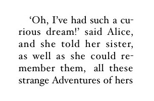
If you choose justified alignment for your interior, then you have to be especially concerned with bad breaks in words. For example:

The words “curious” and “remember” are badly broken up in the above sample. To avoid this, you can kern that particular block of text either slightly looser or slightly tighter to ensure the full words land on one line rather than breaking up into two lines. Believe me when I say that extra little detail can subliminally affect the quality of your book in other people’s eyes. It takes no time at all to fix it, so I highly recommend that you do.
Widows and orphans are a concern whether your text is justified or flush left as shown in the below image:

As shown above, a widow is a lone word stuck on a line by itself anywhere in a page; whereas, an orphan is a lone one or two words that have landed by themselves on a line, up on the next page. Both of these things affect the flow and professional appearance of a book whether you realize it or not. Professional publishers always ensure these types of issues are eliminated by meticulously kerning certain blocks of text throughout the book (as opposed to adding in extra line breaks or paragraph breaks in random places to try to correct the issue).
8. Ensure the table of contents and all headers/footers are accurate before sending any proofs to PPG to forward to the author for review. Each draft should be treated as a finished book and sent to the author as complete as possible.
9. The graphic designer’s fees include the cost of up to two stock photos sourced by the graphic designer for the book. Designers should do everything possible to use whatever materials an author has provided in order to mitigate having to purchase additional stock photos up and above the included two. But if, for some reason, additional graphics need to be purchased, the designer must let PPG know the price so PPG can alert the author to either pay for this or provide their own alternatives.
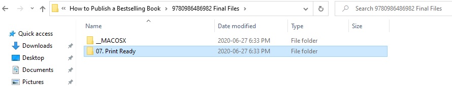
10. All finished and working files must be returned to PPG at the end of the project in a zipped folder that is clear, orderly, and easy for the author to access and sort through.

Related reading: PPG Work-Made-for-Hire Vendor Agreement
You might consider syndicating this content on your own blog. If you do, make sure to attribute the original source so neither of us gets dinged on the SEO front. You can do that by including this line at the bottom of the article: This content first appeared on the PPG Publisher’s Blog and has been republished here with permission.
As a user of this website, you are authorized only to view, copy, print, and distribute the documents on this website so long as: one (1) the document is used for informational purposes only; and two (2) any copy of the document (or portion thereof) includes the following copyright notice: Copyright © 2019 Polished Publishing Group (PPG). All rights reserved.
